Building a Simple Rating Control for ASP.NET 2.0
UPDATE: 16-7-2008 I have updated the control and wrote a new article about it. This new release fixes a few bugs and comes with a better sample web site to try out the control. Check out the new article here.
To show visitors of your site how other visitors feel about the content you're presenting on your site, it's good idea to let your visitors rate your content.
Many web sites take this approach. For example, Amazon uses a 5 star rating approach to rate the articles they're selling. Microsoft's MSDN site uses a nine-bar graph to display the quality of their (technical) articles. My own site uses a five-bar graph to let users rate an article (in the left hand column). Since there are many uses for a rating feature, it makes sense to encapsulate the rating mechanism in a custom ASP.NET Server Control. This article shows you how to build such a control.
Prerequisites
The article assumes you're familiar with C# and ASP.NET 2.0, with the control architecture in particular. However, even if you don't understand all of it, you can just rip the code from this article and use the control directly in your pages.
Introduction
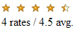
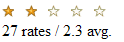
The control (called ContentRating) I am going to build in this article is used to display the rates for a content item and to allow a user to rate an item. It will present the rating with a number of star images like this:
Figure 1 - The ContentRating Control
In this example, the control display an average rating value of 4.5. It shows four full images, one half image and one half "disabled" image. Besides showing the average rate for the content item, a user can also click one of the images to rate the item. When they click the item, the page posts back to the server and raises an event that a page developer can handle to store the rate value in a data store like a database or an XML file.
The control does not deal with retrieving and storing the actual rate values in a data store as this is often quite site specific. However, it does show you where to put your own logic to make this possible.
Before I started building this control, I made a short list with the functionality I wanted it to have. In particular, the control
- must use images (like a star) to indicate the quality of the content item
- must be able to display an arbitrary number of stars. Many sites use a five-star approach but you should also be able to give it, say, 10 stars
- must raise an event to indicate to the page that the user is about to rate an item. It must also raise an event after an item has been rated.
- must be easy to use, without much configuration. Therefore, it should come with a default set of star images.
- must be easy to deploy. Ideally, all you want to deploy is a single .dll file, so the control must embed the default images.
- must keep track of the content items that a user has already rated, to stop a user from rating the same item more than once.
In this requirements list, you'll see a number of issues that make the development of this control an interesting journey. Embedding images in a control is very useful, but can be a bit tricky at first. Also, keeping track of rated items will be an interesting challenge. I'll show you how to accomplish these tasks in the remainder of this article.
Control Design
Let's start by looking at the important classes that make up the ContentRating control. First, there's the ContentRating class itself. This class inherits from CompositeControl, a new control base class in ASP.NET 2 that makes it easy to build controls that contain child controls. I have chosen this class because the ContentRating control contains images (the rating stars) that fire their own postbacks. By inheriting from CompositeControl, you get some stuff for free that you previously had to create yourself. One of the things that CompositeControl does is implement the INamingContainer interface that ensures that child controls automatically get unique control names. The following images shows the full class diagram for ContentRating.
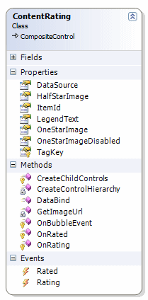
Figure 2 - The Class Diagram of the ContentRating Class
The class has seven properties, seven methods and two events, each of which will be described below.
Properties
| Property Name | Description |
| DataSource |
An array of integers that holds the values for the rated items. The array could look like this: This means that 2 users rated the article with a 1, five users gave it four stars and another five users gave it five stars. |
| HalfStarImage | The image to be displayed to indicate a half star. This image is used when the average rating is between x.3 and x.7. So an average rating of 3.56 displays 3 full images, one half selected image and 1 and a half disabled image. |
| ItemId | An object that holds the unique ID of the content item. This can be an int or a GUID and so on. |
| LegendText | The text below the rating stars. |
| OneStarImage | The image that is displayed for a single selected star. |
| OneStarImageDisabled | The image that is displayed for a disabled star. |
| TagKey | The TagKey for the control. By default, CompositeControl renders as a <span> tag but I have overridden the TagKey property to make the control render as a <table> instead. |
In addition to these properties, the ContentRating class also has a number of methods:
Methods
| Method Name | Description |
| CreateChildControls | Inherited from Control (where CompositeControl ultimately inherits from) and overridden to call the private CreateControlHierarchy method that builds the child controls. |
| CreateControlHierarchy | A private helper method that builds up the child control hierarchy, by adding the star images to an HTML table row. |
| DataBind | Inherited from Control and overridden to store the DataSource in ViewState and then call CreateControlHierarchy to build up the control hierarchy. |
| GetImageUrl | A private helper that returns the full virtual URL for an image. If one of the public properties, like OneStarImage has been set, it uses that value to build up the URL. Otherwise, it used Page.ClientScript.GetWebResourceUrl to get a reference to one of the embedded images. |
| OnBubbleEvent | Inherited from Control and overridden to see if the object that raised an event is one of the star images. If that's the case, the control fires its own events and then cancels the remainder of event handling by returning true. |
| OnRated | Called from OnBubbleEvent when a user has rated a content item. |
| OnRating | Called from OnBubbleEvent when user is about to raise a content item. |
The control also exposes two events that allow a page developer to interact with the control at run-time
Events
| Event Name | Description |
| Rating | Fires when a user has clicked one of the star images to rate the item, but before the actual Rated event is called. This allows a page developer to diagnose the RateEventArgs object that is passed and optionally cancel the Rated event (for example, if the user has already rated the item). |
| Rated | Fires when a user has rated a content item. |
We'll look at some of the inner workings of these properties, methods and events later in the article.
Another important class in the control is the RateEventArgs class. An instance of this class is passed to the page in the Rating and Rated events. A page developer can diagnose this class and then decide to cancel the Rated event, for example when a user has already rated the item. In the Rated event, this class exposes the rate value as an int. With the RateValue property, the page developer can update the database and then rebind the control to the new values. Here's the full diagram for the RateEventArgs class:
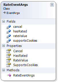
Figure 3 - The Class Diagram of the RateEventArgs Class
The Cancel property allows a page developer in the Rating event to cancel the Rated event. The HasRated property determines whether the current user has already rated the current content item. The ContentRating control keeps track of rates for each user through cookies, so when a cookie for the current content item is found, this property is set to true. In the Rating event, you can set Cancel to true when HasRated is true to stop a user from rating the same item twice.
The RateValue contains the actual value that a user has chosen. This property (an int) always falls between 1 (the lowest possible rate value) and the maximum length of the DataSource array.
Finally, the SupportsCookies property is useful in the Rating event as well. When this property is false, it means the current user agent doesn't support cookies so the ContentRating control cannot keep track of the items a user has rated. In that case, you can use the Rating event to determine whether the user has already rated the item before by some other means, for example, by looking in your database.
The final class worth looking at is the RatingSettings class. This class shields you from the complexity of calculating averages, total scores and whether or not to display a "half image".
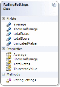
Figure 4 - The Class Diagram of the RatingSettings Class
To use this class, you need to pass an array of integers to its constructor that represents the selected rates. From there, the class calculates the Average, the TotalRates, the TruncatedValue and whether or not you should display a half star image. To see how this works, let's look at an example.
Suppose your rate array looks like this:
ContentRating1.DataSource = new int[] {2, 0, 0, 5, 5};
This means that 2 users rated the article with a 1, five users gave it four stars and another five users gave it five stars. This in turn means that 12 ratings have been made (TotalRates) with an average of 3.91 (2 * 1, plus 5 * 4 plus 5 * 5 divided by 12) . In this case, the control should display four full images and one disabled image. The Average property in this case will contain 3.91; the TotalRates is 12, the TruncatedValue is 4 and the ShowHalfImage is false. The rating will look like this in the browser: 
Let's look at another example :
ContentRating1.DataSource = new int[] {2, 0, 0, 5, 13};
In this case, Average is 4.35; TotalRates is 20 and TruncatedValue is 4 (4.35 rounded down). However, because the fractional part of the average is between 0.3 and 0.7, the ShowHalfImage is set to true. In this case, the control displays four full images and one half image, like this:
If you want to know how the calculation is performed, take a look at the constructor of the RatingSettings class in the file RatingSettings.cs. You can download the full source for the ContentRating control at the end of this article.
The Inner Workings of the ContentRating Control
Now that you have seen some of the important classes used in the ContentRating control, it's time to look at some of its code. I won't show you all the code, but instead focus on some of the important concepts. Remember, you can download the full source at the end of the article.
Let's start by looking at the class declaration:
[
  DefaultProperty("OneStarImage"),
  DefaultEvent("Rate"),
  ToolboxData("<{0}:ContentRating runat='server' />"),
  ToolboxBitmap(typeof(ContentRating), "Resources.ContentRating.bmp")
]
public class ContentRating : CompositeControl
{
As I mentioned earlier, the control inherits from CompositeControl, a useful base class for classes that contain child controls. I also added a number of attributes to the class. The ToolboxData item determines how the control presents itself in the markup of an ASPX page. The {0} placeholder is replaced by the control's TagPrefix which is defined in the AssemblyInfo.cs file in the project:
[assembly: TagPrefix("Spaanjaars.Toolkit", "isp")]
When you add a control on your page by dragging it from the toolbox, you get the following markup:
<isp:ContentRating ID="ContentRating1" runat="server" />
Another interesting attribute is ToolboxBitmap which tells the compiler what image to use for the control in the Toolbox in Visual Studio. For this to work, it's import you set the image's Build Action to Embedded Resource (more on this later). Also note that, because the images are stored in a folder called Resources, I prefixed the image name with Resources. Otherwise, the image won't be found and you end up with the default gear icon.
Right below the class declaration you find a region called Private Variables that holds a number of private fields used throughout the class. All of them are used as backing variables for the control's public properties.
Below the private variables you find a region called Events. This region contains two events: Rating and Rated that fire before and after a user has rated an item in the control. The events are setup using standard C# event handling code using add and remove to keep track of a list of subscribers to the event. For more information about this event handling syntax, get yourself a copy of the book "Professional ASP.NET 2.0 Server Control and Component Development" referenced later in this article in the "Used Resources" section.
The actual events are raised in the OnBubbleEvent method which is called when one of the child ImageButtons is clicked. I'll show you what goes on in this method after I discussed the other code regions in the control.
The Public Properties region contains the seven properties that you saw in Figure 2. The properties are all pretty straight forward, except that in the set block a call is made to this.EnsureChildControls to ensure that the child controls have been created. This is useful for design time support where you want the design surface to reflect any changes you make to the control. For example, when you set the OneStarImage property, the design surface shows your new image immediately.
The region Databinding and Control Creation is the most interesting one. It contains the methods for data binding and to create the control hierarchy. Let's start with the DataBind method:
public override void DataBind()
{
  if (ItemId == null)
  {
    throw new ArgumentException(@"Can't bind a datasource
             without a valid ItemId");
  }

  if (dataSource == null)
  {
    dataSource = new int[] { 0, 0, 0, 0, 0 };
  }

  base.DataBind();
  Controls.Clear();
  ClearChildViewState();
  TrackViewState();
  ViewState["RateItems"] = dataSource;
  CreateControlHierarchy(dataSource);
  ChildControlsCreated = true;
}
This method first determines if the ItemId has been set; without this ID there isn't much to display so an error is thrown instead. Notice that it isn't illegal to have null as the dataSource. It should be possible to display a complete blank rating control when no user has rated the content item before. In that case, the dataSource is set to a default integer array for 5 stars with all zeros.
The code then calls base.DataBind() so the DataBinding event of the control is raised. It then clears the entire child control collection, stores the dataSource in ViewState and then calls CreateControlHierarchy which is responsible for creating the child controls. This method accepts the dataSource as an argument and uses it internally to build up the correct child control collection.
Something similar is performed in the CreateChildControls method:
protected override void CreateChildControls()
{
  Controls.Clear();
  if (ViewState["RateItems"] != null)
  {
    int[] tempDataSource = (int[])ViewState["RateItems"];
    CreateControlHierarchy(tempDataSource);
  }
  else
  {
    if (this.DesignMode)
    {
      // We're displaying on a design surface,
      // so make up a fake datasource.
      int[] tempDataSource = new int[] { 18, 23, 17, 12, 45 };
      CreateControlHierarchy(tempDataSource);
    }
  }
}
The code first checks if the data source (RateItems) has been cached in ViewState. This would be the case on PostBack of the control. Depending on the page developer, DataBind may or may not be called on PostBack. If it isn't, the control is still able to display its ratings from the data source from ViewState. Of course, it's important that view state is enabled on the page for this to work.
If there's no ViewState and the control is currently in DesignMode (meaning it's visible on the design surface of Visual Studio), the code makes up a dummy data source with 5 random numbers.
In both cases, the dataSource is passed to the CreateControlHierarchy method.
The first thing that method does is creating an instance of the RatingSettings class by passing it the dataSource in its constructor:
RatingSettings mySetings = new RatingSettings(theDataSource);
As I explained earlier, this triggers some calculation code that fills the public (and read-only) properties of the RatingSettings class like TruncatedValue and Average.
It then creates a new TableRow object and starts looping for each item (an int) in the data source. Inside the loop, a new TableCell and an ImageButton is created. The ImageButton gets a CommandArgument and a CommandName to keep track of what rating value the image belongs to:
starImage.CommandArgument = numberOfCells.ToString();
starImage.CommandName = "Rate";
The numberOfCells variable loops from 1 through the length of the dataSource array, so you end up with a CommandArgument of 1, 2, 3 and so on.
Next, the code determines what image to display. Remember, there are three options: the full image, the half image and the disabled image:
if (numberOfCells <= mySetings.TruncatedValue)
{
  imageUrl = GetImageUrl(oneStarImage, Constants.RatingOneStarImage);
}
else
{
  if (numberOfCells == mySetings.TruncatedValue + 1
          && mySetings.ShowHalfImage)
  {
    imageUrl = GetImageUrl(halfStarImage, Constants.RatingHalfStarImage);
  }
  else
  {
    imageUrl = GetImageUrl(oneStarImageDisabled,
           Constants.RatingOneStarDisabledImage);
  }
}
starImage.ImageUrl = imageUrl;
When the item being added (numberOfCells) is smaller than or equal to the TruncatedValue, a full image is shown. So, when the average rating is 3.6, the TruncatedValue is 3 and thus three full images will be added. The next if statement sees if the half-star image should be added. It does that by looking at the ShowHalfImage property, but only when the numberOfcells is equal to TruncatedValue + 1. With an average of 3.6, the TruncatedValue is 3 and ShowHalfImage is true, so the fourth image will be the half-star image.
Finally, when both if blocks didn't fire, the oneStarImageDisabled is added.
In each if block, a helper method called GetImageUrl is used. This method look like this:
private string GetImageUrl(string imageUrl, string embeddedImage)
{
  string localImageUrl;
  if (String.IsNullOrEmpty(imageUrl))
  {
    localImageUrl = this.Page.ClientScript.GetWebResourceUrl
                                  (this.GetType(), embeddedImage);
  }
  else
  {
    localImageUrl = base.ResolveUrl(imageUrl);
  }
  return localImageUrl;
}
When the imageUrl has been set (for example oneStarImage) its full virtual path is returned by calling base.ResolveUrl and passing in the imageUrl. However, when the property hasn't been set, the control uses the default images embedded in the assembly. It does this by calling Page.ClientScript.GetWebResourceUrl and passing it the full name of the image. To make the code a bit easier to manage, I have used constants (defined in the file Constants.cs) to refer to the embedded images, like this:
internal static class Constants
{
  internal const string RatingOneStarImage =
          "Spaanjaars.Toolkit.Resources.OneStar.gif";
  internal const string RatingOneStarDisabledImage =
          "Spaanjaars.Toolkit.Resources.OneStarDisabled.gif";
  internal const string RatingHalfStarImage =
          "Spaanjaars.Toolkit.Resources.HalfStar.gif";
}
This way, you don't need to remember the full "path" to the image, but you can refer to it by its name: Constants.RatingOneStarImage for example.
To make the embedded images work with Page.ClientScript.GetWebResourceUrl, you need to do two things:
- Set the image to Embedded Resource in its Build Action property:
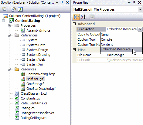
Figure 5 - The Solution Explorer and Properties Pane Showing Embedded Images
- Tell the compiler you really want to expose the embedded image to the outside world. To do that, you need to include it in the AssemblyInfo.cs file like this:
Notice how I am using the same Constants image keys again to refer to the full "namespace" of the image. Without these WebResource directives, you won't get a compiler error, but your images will result in 404 requests.[assembly: WebResource(Constants.RatingHalfStarImage, "image/gif")] [assembly: WebResource(Constants.RatingOneStarDisabledImage, "image/gif")] [assembly: WebResource(Constants.RatingOneStarImage, "image/gif")]
Near the end of the loop in the CreateControlHierarchy method, the ImageButton is added to the TableCell, and the TableCell is added to the TableRow. At the end of the method, the entire TableRow is added to the control's Controls collection. Finally, ChildControlsCreated is set to true, to indicate that the control now contains a valid child control hierarchy.
The final method that we need to look at is OnBubbleEvent that is fired when one of the child controls (the ImageButton controls) raises its Click event. Inside OnBubbleEvent the code sees if the event was raised by a command with its CommandName set to Rate. If that isn't the case, the code sets handled to false and exits. But if the event was raised by one of the ImageButton controls, the following code is executed:
RateEventArgs myArgs =
               new RateEventArgs(Convert.ToInt32(ce.CommandArgument), true);
HttpCookie rateCookie;
cookieKey = String.Empty;
cookieValue = String.Empty;


// Try to set a cookie to indicate the user has rated this item.
if (Context.Request.Browser.Cookies == true)
{
  myArgs.SupportsCookies = true;
  cookieKey = "Rate_" + ItemId.ToString();
  cookieValue = ce.CommandArgument.ToString();

  rateCookie = Context.Request.Cookies["Rate"];

  if (rateCookie == null)
  {
    myArgs.HasRated = false;
  }
  else
  {
    if (rateCookie.Values[cookieKey] == null)
    {
      myArgs.HasRated = false;
    }
    else
    {
      myArgs.HasRated = true;
    }
  }
}
else
{
  myArgs.SupportsCookies = false;
}
This code checks if there is a cookie called Rate. If the cookie isn't there, it means the user has never rated a content item before. But if there is a cookie, the code continues to check if there is a cookie key for the current ItemId. The code uses a multi value cookie called Rate where each cookie key is named Rate_ItemId. Depending on the presence of that cookie, HasRated is set to either true or false.
The final bits in the OnBubbleEvent method deal with firing events:
// Raise the Rating event.
OnRating(myArgs);
As soon as OnRating is called, any event handler code in the APSX page that subscribed to the OnRating event will run. As an argument to the event handler, the code gets an instance of the RateEventArgs class. With this instance, a page developer can determine whether she wants to cancel the Rated event, like this:
protected void ContentRating1_Rating(object sender,
                 Spaanjaars.Toolkit.RateEventArgs e)
{
  if (e.HasRated)
  {
    e.Cancel = true;
  }
}
By setting Cancel to true, the Rated event won't be fired. This way, you can prevent users from rating the same item twice. If you don't mind if a user rates an item more than once, you can choose not to handle the Rating event at all.
Finally, when Cancel isn't true, this code runs:
if (!myArgs.Cancel)
{
  // Create a new cookie value for this rate.
  rateCookie = new HttpCookie("Rate");
  rateCookie.Expires = DateTime.Now.AddMonths(6);
  rateCookie.Values.Add(cookieKey, cookieValue);
  Context.Response.Cookies.Add(rateCookie);
  // Raise the Rated event to notify clients.
  OnRated(myArgs);
  handled = true;
}
This eventually causes the Rated event to be fired which you can handle in your page. The argument passed to the event handler contains the selected value in its RateValue property. With this property, you can update your existing datasource. For example:
protected void ContentRating1_Rated(object sender,
        Spaanjaars.Toolkit.RateEventArgs e)
{
  int rateValue = e.RateValue;
  Guid itemId = myContentItem.Id;
  Content.InsertRating(itemId, rateValue);
}
Note that I just made up this code. The ContentRating control doesn't know anything about your data source. It doesn't understand where to get the rate values from or where to store a new rate value. This is entirely up to the page developer.
This concludes the design and implementation of the ContentRating class. Although the control itself doesn't deal with storing and retrieving rate values from the database, I'll look briefly at using the control in a page in the next section so you can get an idea of where to write code that retrieves the values from the database and to store the new rate value again.
Using the ContentRating Control
Using the ContentRating control is pretty straightforward. Follow these steps to get up and running in no-time:
- Compile the ContentRating control in Visual Studio 2005. Make sure you make a release build.
- Create a new web application in Visual Studio 2005.
- Open the Default.aspx page and switch to Design View. Right click the Toolbox (press Ctrl+Alt+X if it isn't visible) and click Choose Items. Browse to the DLL you created in the previous step. The control will show up in the Toolbox.
- Drag the control from the Toolbox on the Design Surface of your page. You'll see the control appear with 5 images (three full, one half and one disabled).
- Create event handlers for its Rating and Rated event.
- Add code to the Page_Load method to set the initial value of the ContentRating control. Where you get the data from is up to you; as long as the data is an integer array with the rate values.
- Call DataBind() to bind your data source to the control.
The following code snippet shows the code behind of a page that uses the ContentRating control. For demonstration purposes, it uses ViewState as the backing store. Obviously, in a real world application you would use a data store like a database to retrieve and store the rate values.
protected void Page_Load(object sender, EventArgs e)
{
  if (!IsPostBack)
  {
    ContentRating1.ItemId = Guid.NewGuid();
    ContentRating1.DataSource = Values;
    ContentRating1.DataBind();
  }
}

protected void ContentRating1_Rating(object sender,
          Spaanjaars.Toolkit.RateEventArgs e)
{
  if (e.HasRated)
  {
    e.Cancel = true;
  }
}

protected void ContentRating1_Rated(object sender,
           Spaanjaars.Toolkit.RateEventArgs e)
{

  int[] tempValues;
  tempValues = Values;
  tempValues[Convert.ToInt32(e.RateValue) - 1] += 1;
  Values = tempValues;
  ContentRating1.DataSource = Values;
  ContentRating1.DataBind();
}

public int[] Values
{
  get
  {
    object values = ViewState["Values"];
    if (values != null)
    {
      return (int[])values;
    }
    else
    {
      return new int[] { 17, 0, 0, 5, 5 };
    }
  }
  set
  {
    ViewState["Values"] = value;
  }
}
And combined with this markup:
<isp:ContentRating
  ID="ContentRating1"
  runat="server"
  OnRated="ContentRating1_Rated"
  OnRating="ContentRating1_Rating"
  LegendText="{0} rates / {1} avg."
/>
you end up with the following control in your browser:
Figure 6 - The ContentRating Control as it Appears in the Browser on Page Load
If you click the fifth star, the control will change to this:
Figure 7 - The ContentRating Control as it Appears in the Browser after PostBack
If you click one of the stars again, nothing happens because the control knows you already rated this item.
Summary
Building controls can be a daunting task. However, once you get the hang of it, it becomes much easier. Once you mastered the learning curve for Custom Controls, they tend to become a viable solution much more often. Instead of recreating some functionality in every site you build, you can use Custom Server controls and drag and drop to build a fully functional site in no time.
Hopefully, this article got you enthusiastic for building controls. If you have suggestions or enhancement requests for this control, or used my ContentRating control to kick start development of your own controls, please let me know.
Enhancements and Extensions
This is just a very basic control and I can think of many enhancements and extensions, including:
- Derive from CompositeDataBoundControl instead of from CompositeControl. The CompositeDataBoundControl class has some additional behavior targeted at data bound controls. I haven't really looked into this class much, so I don't know how useful it will be.
- Extend the images with OnMouseOver behavior where each star lights up when you hover over it. That way, it's easier for a user to see with what value they're going to rate the item. You could do that by writing some JavaScript that changes the images when a user hovers of them. You can embed the JavaScript in the assembly similar to how I embedded the star images.
- Add a TextBox control to the ContentRating so users can let you know *why* they gave the item a specific rating.
- Offer the page developer different sets of images, for example with different colors or sizes. That way, a page developer can change all the images at once by choosing from a simple drop down list with image sets. Once again, you should embed all the images in the assembly and change GetImageUrl so it returns a correct path to the images.
I wrote the ContentRating control while writing this article, so it hasn't been used or tested extensively in a real-world application. If you use this control and run into problems, let me know and I'll try to fix them and update the article.
Used Sources
For the research for this article, I used the following resources:
- Book: Professional ASP.NET 2.0 Server Control and Component Development by Dr. Shahram Khosravi (Wrox)
- Book: Developing Microsoft ASP.NET Server Controls and Components by Nikhil Kothari (Microsoft Press). This book is aimed at .NET 1.x but a lot of concepts are still applicable in .NET 2.
- Whats with System.Web.UI.WebResourceAttribute?
- Embedding Resources in ASP.NET 2.0 Assemblies
- Using WebResource.axd for embedded resources
Download Files
Where to Next?
Wonder where to go next? You can post a comment on this article.
Links in this Document
| Doc ID | 410 |
| Full URL | https://imar.spaanjaars.com/410/building-a-simple-rating-control-for-aspnet-20 |
| Short cut | https://imar.spaanjaars.com/410/ |
| Written by | Imar Spaanjaars |
| Date Posted | 12/06/2006 13:21 |
| Date Last Updated | 07/17/2008 12:27 |
| Listened to when writing | Let Your Good Heart Lead You Home by Editors (Track 1 from the album: Cuttings) |
Comments
Talk Back! Comment on Imar.Spaanjaars.Com
I am interested in what you have to say about this article. Feel free to post any comments, remarks or questions you may have about this article. The Talk Back feature is not meant for technical questions that are not directly related to this article. So, a post like "Hey, can you tell me how I can upload files to a MySQL database in PHP?" is likely to be removed. Also spam and unrealistic job offers will be deleted immediately.
When you post a comment, you have to provide your name and the comment. Your e-mail address is optional and you only need to provide it if you want me to contact you. It will not be displayed along with your comment. I got sick and tired of the comment spam I was receiving, so I have protected this page with a simple calculation exercise. This means that if you want to leave a comment, you'll need to complete the calculation before you hit the Post Comment button.
If you want to object to a comment made by another visitor, be sure to contact me and I'll look into it ASAP. Don't forget to mention the page link, or the Doc ID of the document.