Enhancing Design-Time Support in your Controls
Server controls allow a page developer to drag and drop a page together in no to time. Most of these controls come "out of the box" with ASP.NET like the TextBox, the Label, the DataGrid and many other controls. Changing the appearance and behavior of these controls is often as easy as visually setting a few properties in the properties grid for your design application, like Visual Studio .NET or the Web Matrix.. To make this process even easier, many properties can be expanded and collapsed in the property grid. By collapsing a property like the Font style, you end up with a shorter and much cleaner property list, making it easier to locate and change your properties.
Adding these collapsible properties to your own server controls is possible as well. This article will guide you through the process of creating a simple server control that exposes a collapsible property in the property grid of visual designers like Visual Studio.NET or the Web Matrix.
Prerequisites
I'll be using Visual Studio .NET 2003 in this article, so it's handy if you have that around. Don't worry if you have Visual Studio .NET 2002; most of the concepts I explain in this article work on that version as well.
It's also handy if you have a working ASP.NET Web application to test out the control. Since we'll be dealing mostly with design-time issues, this is not really required, but of course it's useful to test out the functionality of your control in a real life application.
The Basics
For the purpose of this article, I will build design-time support for the the labels of a very simple rating control that allows a user to rate an item on your Web site from 1 to 5. Below the numbers 1 and 5 there will be a short label describing the meaning of the number. The control could look like this:
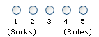
Figure 1: The Rating Control
To allow a page developer to change the text for the minimum and maximum value, the control will expose an expandable ScaleLegend property. This ScaleLegend property is of type Legend, a custom class that is added to the control project. The Legend class in turns exposes MinimumValueText and a MaximumValueText properties. In the property grid the Legend property will look like this: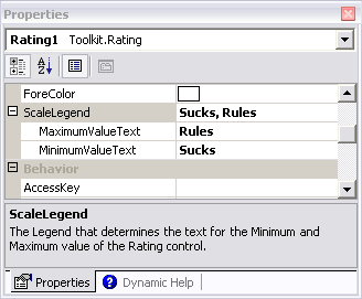
Figure 2: The Property Grid for the ScaleLegend Property.
Note that I won't be implementing the actual rating mechanism, nor other properties like the ID of an article the user can rate. This article will focus exclusively on expandable properties. To keep this article simple and focused, all that the control does is output a simple HTML table with two cells: one holding the MinimumValueText and one with the MaximumValueText.
Creating the Control
Now that I briefly discussed the Legend property for the control and its designer, let's get to work and create the control.
- Start Visual Studio .NET and create a new Web Control Library in the language of your choice. I'll be using C# in this article, but you could choose Visual Basic .NET as well. I am calling my project and default namespace Toolkit, but obviously you can choose another name if you want.
- Next, add a new class file and call it Legend.cs. Remove the default code, and replace it with this code:
(I am not reproducing the XML comments here, but in the code download for the article you'll find <summary> and other tags tags describing the purpose of important elements in the project.)
using System;
namespace Toolkit
{
  public class Legend
  {
    private string minimumValueText = "Sucks";
    private string maximumValueText = "Rules";

    public Legend() {}

    public string MinimumValueText
    {
      get
      {
        return minimumValueText;
      }
      set
      {
        minimumValueText = value;
      }
    }

    public string MaximumValueText
    {
      get
      {
        return maximumValueText;
      }
      set
      {
        maximumValueText = value;
      }
    }
  }
}
Not much complex is going on in this class; just a simple class with two public string properties. - Next, it's time for the actual control. Rename the file WebCustomControl1.cs to Rating.cs and replace the code in that file with the following:
using System;
using System.Web.UI;
using System.Web.UI.WebControls;
using System.ComponentModel;

namespace Toolkit
{
  [
  DefaultProperty("ScaleLegend"),
  ToolboxData("<{0}:Rating runat='server'></{0}:Rating>")
  ]
  public class Rating : WebControl, INamingContainer
  {

    private Legend scaleLegend = new Legend();

    [
      Browsable(true),
      Category("Appearance"),
      Description("The Legend that determines the text for " +
          "the Minimum and Maximum value of the Rating control.")
    ]
    public Legend ScaleLegend
    {
      get
      {
        return scaleLegend;
      }

      set
      {
        scaleLegend = value;
      }
    }

    protected override void Render(HtmlTextWriter writer)
    {
      // Make sure the control is nested in a form
      if (Page != null)
      {
        Page.VerifyRenderingInServerForm(this);
      }
      writer.RenderBeginTag(HtmlTextWriterTag.Table);

      writer.RenderBeginTag(HtmlTextWriterTag.Tr);

      writer.AddAttribute(HtmlTextWriterAttribute.Align, "left");
      writer.RenderBeginTag(HtmlTextWriterTag.Td);

      writer.Write("\t" + scaleLegend.MinimumValueText);

      writer.RenderEndTag();

      writer.AddAttribute(HtmlTextWriterAttribute.Align, "right");
      writer.RenderBeginTag(HtmlTextWriterTag.Td);

      writer.Write(scaleLegend.MaximumValueText + "\r\n");

      writer.RenderEndTag(); //td
      writer.RenderEndTag(); //tr
      writer.RenderEndTag(); //table
    }
  }
}
Again, not too much exiting is going on. This control has a simple ScaleLegend property with a set and a get method. Inside the Render method, responsible for outputting the HTML to the user agent, an HTML table is created. The table consists of one row that in turn has two cells. Inside those two cells, the MinimumValueText and MaximumValueText values are displayed.
At this point, you have a complete and functional control. It doesn't do much, but it works as expected. The next step is to try out the control by adding it to the design surface of an ASPX page. You can do that by running the control in debug mode, and then adding an instance of it to an ASPX page. For more details how to do this, check out this FAQ.
If you add the control to a page, you'll notice that the ScaleLegend property is not available in the property grid. It's there, but it's grayed out. 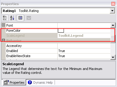
Figure 3: The Read-Only ScaleLegend property in the property grid
This is because the property grid does not know how to handle the Legend class. To tell the property grid how to deal with that class, you'll need to create a TypeConverter. A TypeConverter, as it name implies, allows you to convert types. In our scenario, we'll use it to convert a Legend to individual string properties and vice versa. For a successful TypeConverter, you'll need to override the methods CanConvertFrom, ConvertFrom and ConvertTo. The first method is used to indicate the types of conversions that are supported, the other two are responsible for the actual conversion. To implement the TypeConverter for the Legend class, follow these steps:
- Add a new class file to the project and call it LegendConverter.cs.
- Replace the default code with this code:
The ConvertFrom method receives the string that is entered in the property grid and parses it. If the format is valid (the string is in the format MinimumValueText, MaximumValueText) a new Legend object with the two string properties set is returned. Otherwise, an error is thrown.using System; using System.ComponentModel; using System.Globalization; namespace Toolkit { internal class LegendConverter : ExpandableObjectConverter { public override bool CanConvertFrom( ITypeDescriptorContext context, Type t) { if (t == typeof(string)) { return true; } return base.CanConvertFrom(context, t); } public override object ConvertFrom(ITypeDescriptorContext context, CultureInfo info, object value) { if (value is string) { try { string s = (string) value; // The value will have the format // "MinimumTextValue, MaximumTextValue" // We need to split it on the comma int comma = s.IndexOf(','); if (comma != -1) { string delimStr = ","; char [] delimiter = delimStr.ToCharArray(); string [] splits = s.Split(delimiter); if (splits.Length == 2) { string minValue = splits[0].Trim(); string maxValue = splits[1].Trim(); Legend l = new Legend(); l.MinimumValueText = minValue; l.MaximumValueText = maxValue; return l; } } } catch {} // Whoops. Parsing failed. Throw an error. throw new ArgumentException( "Conversion from \"" + (string) value + "\" to a Legend failed. Format must be" + "\"MinimumTextValue, MinimumTextValue\""); } return base.ConvertFrom(context, info, value); } public override object ConvertTo(ITypeDescriptorContext context, CultureInfo culture, object value, Type destType) { if (destType == typeof(string) && value is Legend) { Legend l = (Legend) value; // Build the string as "MinimumTextValue, MinimumTextValue" return l.MinimumValueText + ", " + l.MaximumValueText; } return base.ConvertTo(context, culture, value, destType); } } }
The ConvertTo method does the exact opposite: it receives a Legend object and returns a string by concatenating the two string values. - Once you have the LegendConverter class ready, the next step is to hook up the Legend class to that converter. You do that by decorating your Legend class with a TypeConverterAttribute:
The TypeConverterAttribute lives in the System.ComponentModel namespace, so to successfully apply this attribute you'll need to add a reference to that namespace by adding the the following code to the top of the file:namespace Toolkit {[ TypeConverter(typeof(LegendConverter)) ]public class Legend { private string minimumValueText = "Sucks"; private string maximumValueText = "Rules";using System;
using System.ComponentModel;
namespace Toolkit { - To indicate to the designer how it should serialize the values of the sub properties of the Legend class (the MinimumValueText and the MaximumValueText), you'll also need to add the PersistenceMode and DesignerSerializationVisibility attributes to the ScaleLegend propertry of the Rating class:
The PersistenceMode.Attribute will force the designer to add the values for the Legend class as sub properties on the Rating element in the format ParentProperty hyphen SubProperty. This would end up as ScaleLegend-MinimumValueText for example. If you'd use PersistenceMode.InnerProperty instead, the values would be persisted as nested tags within the Rating element.[ Browsable(true), Category("Appearance"), Description("The Legend that determines the text for " + "the Minimum and Maximum value of the Rating control."),PersistenceMode(PersistenceMode.Attribute), DesignerSerializationVisibility (DesignerSerializationVisibility.Content)] public Legend ScaleLegend
DesignerSerializationVisibility.Content tells the designer that it should serialize the values of the sub properties, rather than the property itself. - Save your project, compile it and add the control to your toolbox in Visual Studio .NET. You can either debug the control and get a second instance of VS.NET, as explained earlier, or you could compile a final version and then add it to the toolbox in one of your existing ASP.NET projects. Drag an instance of the Rating control to the design surface of an ASPX page, and then look at the property grid. You should see something similar to figure 4:
Figure 4: The Property Grid for the ScaleLegend Property. - Change the values for MaximumValueText and MinimumValueText in the property grid. You'll notice that the parent property, ScaleLegend does not automatically change. Also, the design surface is still displaying the old values. You need to click the ScaleLegend property for its value to update. Even worse, you'll need to manually force a change in the ScaleLegend property to have the design surface update itself. I'll explain how to fix this in the next section.
- If you look at the markup in the .aspx page for the Rating control, you should see something similar to this:
<cc1:Rating id=Rating1 runat="server"
  scalelegend-minimumvaluetext="Hate It!"
  scalelegend-maximumvaluetext="Love It!">
</cc1:Rating>
Enhancing the Design-Time Behavior
Right now, the property works as you'd expect. You can either change the parent property directly, or expand it and change its sub properties. However, the behavior is a little odd; when you change one of the sub properties, the parent is not updated correctly. Also, the designer surface is not updated. Fortunately, the fix is pretty easy. Once again, we need to apply a few attributes to get the desired behavior:
- In the file Legend.cs, locate the MinimumValueText property and add the following attributes (note that the Description property is not required; this property is just responsible for displaying a descriptive message in the property grid when the MinimumValueText sub property has the focus):
  [
    Description("The text that is displayed for the Minimum " +
          "value of the Rating control."),
     NotifyParentProperty(true),
    RefreshProperties(RefreshProperties.Repaint)
  ]
public string MinimumValueText { get
Repeat this for the other property: MaximumValueText and don't forget to alter the text for the Description property. - Once more, compile the control and add an instance to an ASP.NET form. Expand the ScaleLegend property and change one of its sub values. As soon as the field looses focus (for example, when you tab away), you'll see the parent property and the designer surface update to reflect the change.
Summary
Building your own server controls requires a lot of effort. However, once they are ready and thoroughly tested, they can save you and your page developers a lot of work. If you are building your own controls, don't forget to consider (and build) design time support. This article has shown you one aspect of design-time support: the implementation of expandable properties. However, there are many more design-time features to your controls to make them easier and quicker to use. Check out the References section to find out more about server controls in general, and design-time support in particular.
Extensions
I have focused on expandable properties in this article. However, to make your control even easier to use, you could implement the following improvements.
Apply the DefaultValueAttribute to the ScaleLegend's Sub Properties
Applying this attribute will cause the designer to remove the attributes from the tag if their values match the default value. It also allows you to reset the sub property to its default value by right-clicking the property in the designer and choosing Reset. It's not required, but it makes the most sense to set the default value for these properties equal to the default value of the two private variables, minimumValueText and maximumValueText.
Apply the DefaultPropertyAttribute to the ScaleLegend Property
The DefaultProperty attribute will cause the designer to put the focus on the ScaleLegend whenever you select the control in the desuigner. This allows you to quickly change the labels for the Legend.
References
- Make Your Components Really RAD with Visual Studio .NET Property Browser
- Introduction to TypeConverters, Part II: Expandable Object Converter...
- Adding Design-Time Support to ASP.NET Controls
- ExpandingTable with Design-Time support
Download Files
Source Code for this ArticleWhere to Next?
Wonder where to go next? You can post a comment on this article.
Links in this Document
| Doc ID | 307 |
| Full URL | https://imar.spaanjaars.com/307/enhancing-design-time-support-in-your-controls |
| Short cut | https://imar.spaanjaars.com/307/ |
| Written by | Imar Spaanjaars |
| Date Posted | 06/24/2004 18:17 |
| Date Last Updated | 06/29/2004 14:46 |
| Date Last Reviewed | 06/06/2006 22:21 |
| Listened to when writing | Bursting by Anne Clark (Track 8 from the album: Pressure Points) |
Comments
Talk Back! Comment on Imar.Spaanjaars.Com
I am interested in what you have to say about this article. Feel free to post any comments, remarks or questions you may have about this article. The Talk Back feature is not meant for technical questions that are not directly related to this article. So, a post like "Hey, can you tell me how I can upload files to a MySQL database in PHP?" is likely to be removed. Also spam and unrealistic job offers will be deleted immediately.
When you post a comment, you have to provide your name and the comment. Your e-mail address is optional and you only need to provide it if you want me to contact you. It will not be displayed along with your comment. I got sick and tired of the comment spam I was receiving, so I have protected this page with a simple calculation exercise. This means that if you want to leave a comment, you'll need to complete the calculation before you hit the Post Comment button.
If you want to object to a comment made by another visitor, be sure to contact me and I'll look into it ASAP. Don't forget to mention the page link, or the Doc ID of the document.